What are the basics of a good graphic chart?
Do you know what a graphic charter is? Have you designed one for your company?
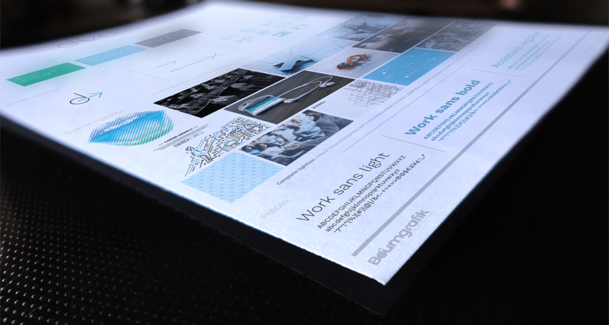
First of all, you have to understand that a graphic charter is a document that includes the standards and rules regarding the communication of the mark. It should present graphical components, but also editorial elements.
Let’s look more specifically at the objectives of a graphic charter and what should be in it!
The objectives of a graphic charter
A graphic charter aims to create consistency and uniformity in your company’s communication, by graphically grouping its soul, its universe and its values. It supports the creation of a strong Brand Image Brand Image and allows your business to be easily recognized and remembered by customers, prospects and partners.
Your image should always be similar, regardless of the medium used, the person sending the message or the person receiving it. With this in mind, all your communication tools should be presented according to the rules set out in your graphic charter. With it, the message is correctly transmitted, uniformly, from the company to the public.
The elements contained in the graphic charter
Specific visual and editorial elements are usually found in a well-executed corporate graphic charter.
The Logo
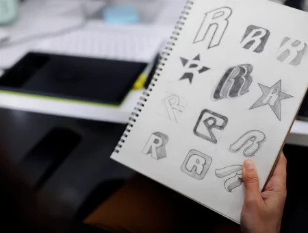
The logo is often the heart of branding brands. It must be adaptable and available on all types of communication media that can be used by the company.
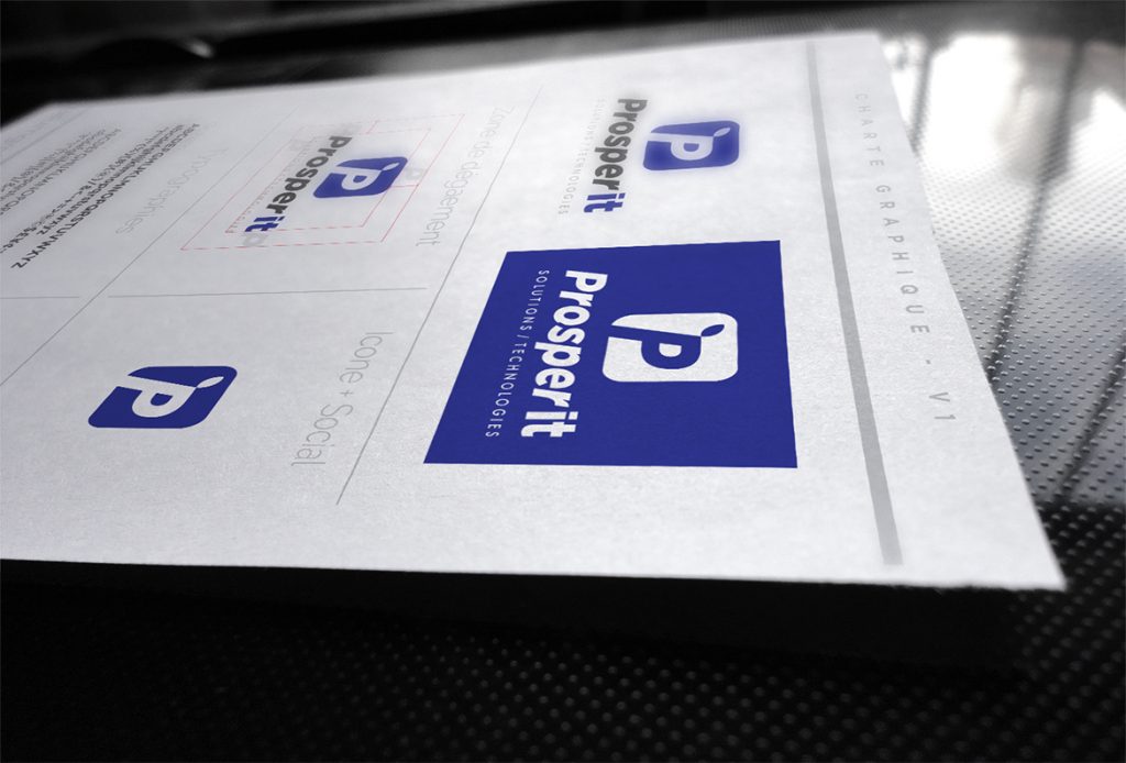
Once you have created your logo, the graphic chart will help you to specify the usage tags, in terms in particular of declensions, sizes and proportions. For example, your chart should indicate the proportions that the logo must maintain in height and length so that it is not deformed, the minimum size it must have to be legible and what clearance must there be around the logo to ensure that it is clearly visible in all communications.
This will prevent it from being presented in the wrong colors, in a format that is too small, in the wrong dimensions, etc.
The graphic charter of your brand will also allow you to identify the positioning of the logo in relation to other elements that could be found in the documents.
The typography
Avez-vous déjà remarqué que les entreprises ont souvent leur propre style typographique et en général s’y tiennent? Cela permet de créer une impression et des émotions chez le public, en plus de reconnaître facilement la marque.
Thanks to the graphic charter, you have the chance to define the fonts that can be used in the communication tools associated with your company. Also identify when a font should be used over another.
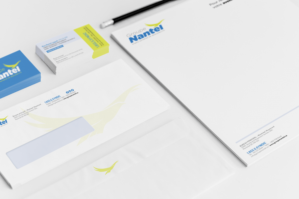
It is also advisable to specify in the graphic charter the recommended layout of documents and other communication tools. For example, you might determine that all outgoing letters should show the company logo at the top left with such proportions, and the address should be at the bottom right.
This makes it possible to use the writing styles identified in the brand image and approved by the company, in addition to visually standardize all media of the brand.
The color palette
To have a strong visual identity, your brand should select a few colors that will be associated with it, ensuring the creation of a distinctive visual universe. It also helps to help the memory and public recognition of your business.

These colors should be in the graphic chart to stick to it. To do this, integrate the color palette chosen by the company as well as the Pantone color references so that the colors are easily found and avoid mistakes.
You should also add the possibilities in the declensions of the logo in white and black. How should the logo be used on a black background? White background? Is it possible to use it in reverse color?
Images and graphic elements
All the graphic elements, photos and images associated with your brand should be harmonized and follow the same guideline, whether you want lifestyle or cartoon images, for example. In other words, everything you decide in terms of images should be indicated in the graphic chart, whether you want to never see people’s faces, stay in cold tones or use only wooden tableware.
Thus, putting examples of illustrations in your graphic chart will help visual consistency.
Additional tips for graphic charters
- The rules for inserting each element (for example, margins and positioning in documents and other media).
- The tone and style of the writing.
- Declination rules for different media.
We advise you to put as many elements as possible in your graphic chart and to be precise. This will avoid misinterpretations and errors. Remember that employees will have to share and spread the corporate brand correctly. It is therefore useful to take the time to develop all the elements that will be part of your graphic and editorial world.
In addition, try to choose components that are sustainable over time, to avoid having to restart the creation of the graphic charter. Do not hesitate to call on experts to build a strong identity from the beginning.
You want to design the graphic charter of your brand? Trust the experts.
Related posts
How to revitalize an existing brand?
Revitalizing an existing brand maintains its relevance. This operation allows it to better respond to market...
Read moreThe Importance of PPC Conversion Tracking
Pay-Per-Click (PPC) is a popular online advertising method for businesses looking to reach their target audience...
Read moreThe fundamentals of your branding dictate the perception of your brand by your potential customers
Branding is the set of actions implemented to manage the image of a brand and improve...
Read moreIs Google Ads and service companies a good mix?
Service companies operate in the tertiary sector. They therefore provide services, also called intangible goods, in...
Read moreTypography and its impact on your branding
Typography is an essential part of a company’s brand image. It is the art of playing...
Read moreColors and the importance of their meanings for your branding
Colors are one of the essential elements that make up the visual identity of a brand....
Read moreWhy invest in a memorable brand image?
Many companies are currently spending huge amounts of money to improve public perception through the creation...
Read moreThe elements of a corporate graphic identity
The graphic identity of a company can be considered as the very face of it. Indeed,...
Read moreTrackback URL: https://boumgrafik.com/en/what-are-the-basics-of-a-good-graphic-chart/trackback/
