Quebec microbrewery branding
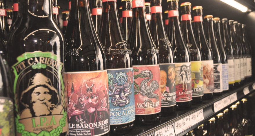
With the rise of microbreweries in Quebec, they must be increasingly creative to stand out and attract consumers to their products. And that goes by their brand image!
Needless to say, we love to analyze microbrewery branding! We have therefore analyzed 3 brand images of Quebec companies just for you.
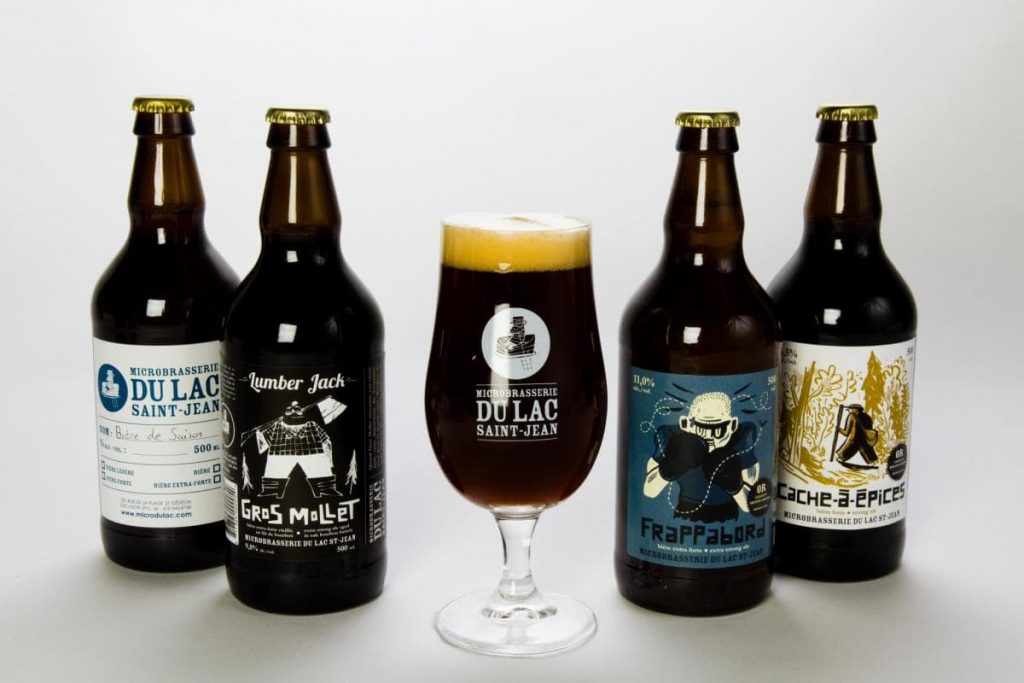
Branding of the Lac Saint-Jean Microbrewery
The Microbrasserie du Lac St-Jean is located in St-Gédéon and has been open since 2007.
Through the imagery of their beers, the microbrewery does not hide its Quebec roots. Its origins are an integral part of the company’s values and are reflected in the choice of the name of beers: Gros Mollet, Vire-Capot, etc.
The typography and the color chart used also evoke the terroir. Despite a uniform font according to the different graphic elements, the body and the disposition are different from one letter to another. The colors used by this microbrewery – such as brown and coppery red – are also often attributed to shades of the earth.
Finally, illustrations with imperfect and asymmetrical forms evoke very well the conviviality of this company here.
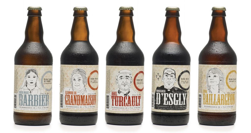
Branding at the Microbrasserie on Île d'Orléans
For the Microbrewerie Île d’Orléans, the image of its products revolves around people. It is with intelligence and humor that the microbrewery keeps a bit of local history in mind. Through its beers, we commemorate the men and women who have contributed in their own way to the development of the island of Orleans, such as Marie Barbier or Eleonore de Grandmaison.
All the branding of this microbrewery takes us back in time. The motif and the colors of the labels remind us of the wallpaper, but go very well with the portraits of the local heroes, drawn in black and white. Typography, imposing but refined, seems straight out of the time of New France
The visual universe of the Corsaire
Located in Lévis and Lauzon, the microbrewery Le Corsaire has created an interesting, simple and coherent visual universe, which revolves around the theme of piracy. Besides the images, this theme is found everywhere, especially in corporate speech and in the names of some beers. For example, the Queen Anne’s Revenge, which refers to the ship of the pirate Black Beard, and Anne Bonny, who is one of the most famous pirate women in history.
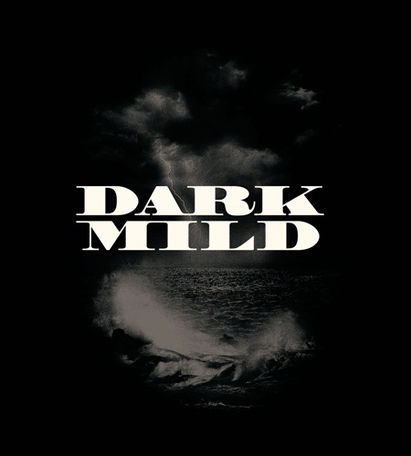
This microbrewery puts on the same guideline for beer images, while designing a different typographic style for each of them. Dark imagery focuses on black and white, and presents living details.
The branding of these microbreweries has strong elements and a strong personality. They knew how to handle and play with the different components in order to create a unique brand image.
Do you want to refresh or create communication tools that really reflect the foundations of your business?
Related posts
How to revitalize an existing brand?
Revitalizing an existing brand maintains its relevance. This operation allows it to better respond to market...
Read moreThe Importance of PPC Conversion Tracking
Pay-Per-Click (PPC) is a popular online advertising method for businesses looking to reach their target audience...
Read moreThe fundamentals of your branding dictate the perception of your brand by your potential customers
Branding is the set of actions implemented to manage the image of a brand and improve...
Read moreIs Google Ads and service companies a good mix?
Service companies operate in the tertiary sector. They therefore provide services, also called intangible goods, in...
Read moreTypography and its impact on your branding
Typography is an essential part of a company’s brand image. It is the art of playing...
Read moreColors and the importance of their meanings for your branding
Colors are one of the essential elements that make up the visual identity of a brand....
Read moreWhy invest in a memorable brand image?
Many companies are currently spending huge amounts of money to improve public perception through the creation...
Read moreThe elements of a corporate graphic identity
The graphic identity of a company can be considered as the very face of it. Indeed,...
Read moreTrackback URL: https://boumgrafik.com/en/quebec-microbrewery-branding/trackback/
