How to choose the typography of your branding?
The typography of a branding is not an aspect that can be neglected. Indeed, the fonts must meet the various needs of the company, attract the target customers and mark the mark of its competitors
Typography is part of the brand image of a company and, in this sense, it must be well thought out and carefully chosen. The use of bad typography can particularly repel your potential customers. Do not just choose a font that you consider pretty!
Here are some rules of use and tips to follow to use the perfect font for branding your business!
Basic rules for the typography of your branding
There are some basic rules to choose the typography of your branding without making a mistake!
First, it is important not to use too many different fonts. This imbalances the visual and creates an unpleasant and sometimes disconcerting effect! It is recommended to use a maximum of 3 fonts in its branding and communication media.
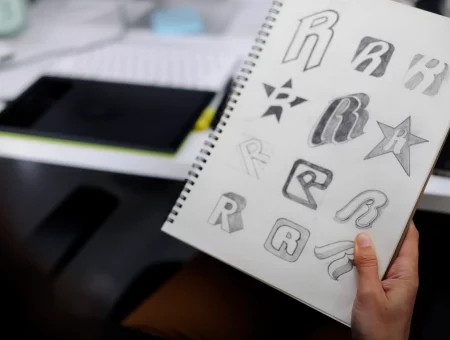
Obviously choose fonts that fit well. Do some tests. Do not be afraid to play with contrasts and sizes!
Plus, use your fonts wisely. For example, you could use one specifically for creating your logo and another for the content of your communication tools. In any case, make sure the writing is easy to read.
We can never say it enough: be unique! Use different fonts from your competitors and well-known brands. This will help you stand out more easily and create your own identity.
Finally, stay simple. This will ensure you to be readable at all times, which is very important. Plus, simplicity is the best way to be impactful!
Consider your target audience
In addition to the basic rules, you should also consider the characteristics of your target customers to use a branding typography that catches them and that arouses their interest.
So the choice of your fonts will change according to certain characteristics of your prospect, such as gender, age, personality and what he is looking for in a company that offers your products or services.
In addition, each font family relates to an interest, value, or attitude, which will “speak” or not to the public. Thus, the serif font generally refers to traditional and high-end; the sans serif is reminiscent of modernity and simplicity; the cursive is rather elegant and amusing; MPV font refers to editorial and editorial; and the fantasy font refers to the playful.
Thus, a consumer who is in a high social class and wants to demonstrate its standing, will respond more favorably to the serif police. If this consumer is part of your target audience, then you should probably favor this font.
Or, a brand that is aimed at children should have a more fun font. Consider the Lego logo. It is created with a writing that reminds of bubbles, games and children, their target audience.
In summary, it is important to use a font that attracts your prospects and in which they identify.
Present the personality of your brand
The fundamentals, values and personality of your company will also influence the choice of the typography of your branding. Indeed, it refers to specific characteristics. You need to identify which brands you want to put forward. Do you want to introduce your brand to the public as accessible, engaged, reliable or innovative?
As mentioned above, fonts convey different meanings. So you need to choose fonts that project the right message about your brand.
For example, a young and dynamic brand should not choose a font that breathes too much the noble. There would be a gap between the personality of the brand and its visual communication.
We can also play with contrasts and other peculiarities. Examples include bold fonts that symbolize solidity, handwriting that refers to simplicity and craftsmanship, and italic (or curved fonts) that refer to movement.
You must therefore select the type of typography and its characteristics that reflect what you want to project as an image.
Consider the context of use
Each writing font can be consistent and adequate in one context, but not in another. Thus, you may have to make different choices, depending on whether you use typography for your website, for your logo, for an information document or for a billboard. So, think carefully about the fonts used in each created communication tool.
For example, it is generally advisable to keep a standard typography and no frills for text bodies, so that they are clear and visible. With this in mind, a book, an ebook or a long article should be written with a serif font.
Internet sites should have a font that makes it easier to read. As for the billboards, they should be created with typography that can be seen from afar.
In short, the font changes according to the use, the message transmitted and the desired impact on the target audience.
Find your branding typography
Choosing your writing fonts wisely for your branding is an art. There is a whole process of research, analysis and creativity associated with this work. If it’s not your cup of tea or if you think you need help, why not use a Branding Agency?
Vous désirez trouver la typographie de branding qui reflète la personnalité de votre marque, qui attire vos clients potentiels et qui est cohérente avec le message à transmettre?
Related posts
How to revitalize an existing brand?
Revitalizing an existing brand maintains its relevance. This operation allows it to better respond to market...
Read moreThe Importance of PPC Conversion Tracking
Pay-Per-Click (PPC) is a popular online advertising method for businesses looking to reach their target audience...
Read moreThe fundamentals of your branding dictate the perception of your brand by your potential customers
Branding is the set of actions implemented to manage the image of a brand and improve...
Read moreIs Google Ads and service companies a good mix?
Service companies operate in the tertiary sector. They therefore provide services, also called intangible goods, in...
Read moreTypography and its impact on your branding
Typography is an essential part of a company’s brand image. It is the art of playing...
Read moreColors and the importance of their meanings for your branding
Colors are one of the essential elements that make up the visual identity of a brand....
Read moreWhy invest in a memorable brand image?
Many companies are currently spending huge amounts of money to improve public perception through the creation...
Read moreThe elements of a corporate graphic identity
The graphic identity of a company can be considered as the very face of it. Indeed,...
Read moreTrackback URL: https://boumgrafik.com/en/how-to-choose-the-typography-of-your-branding/trackback/
