Pâtisserie La Germanique – Brand image
Mandate
Boumgrafik has been mandated to develop the brand image and communication tools of La Germanique bakery wishing to establish its presence on the North Shore of Montreal
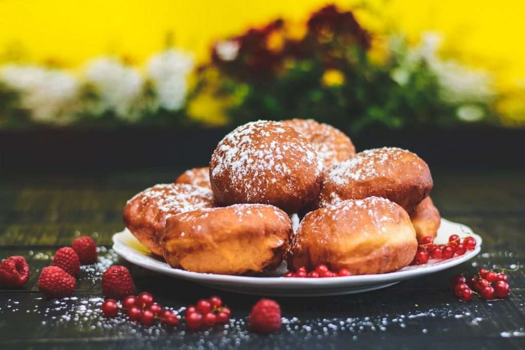
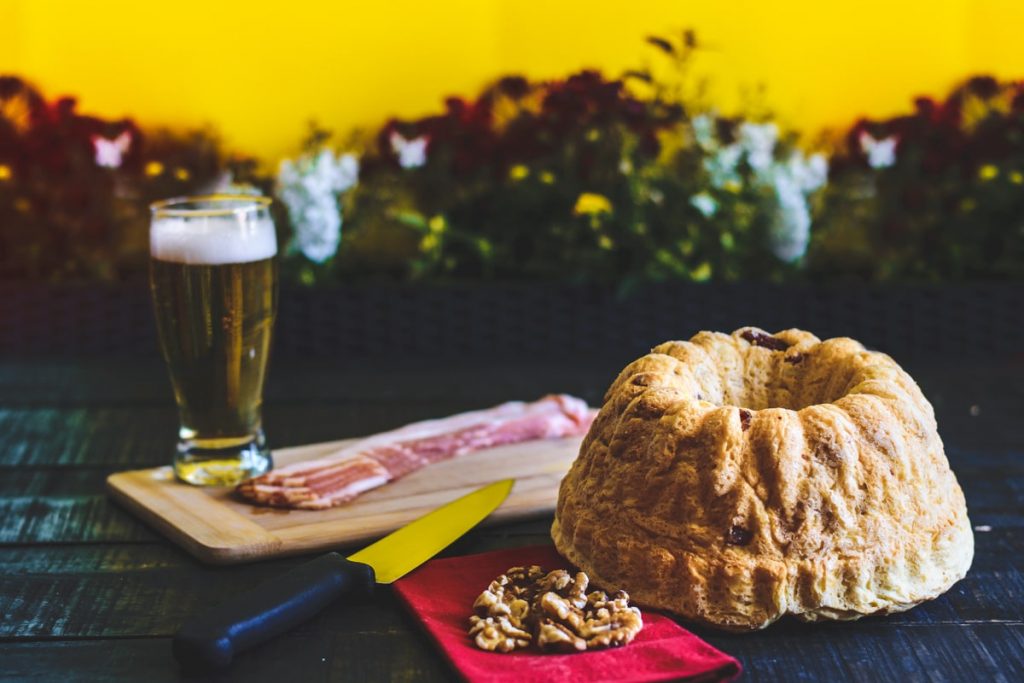
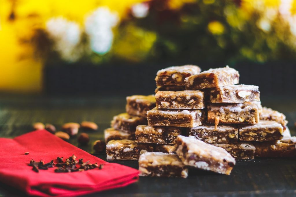
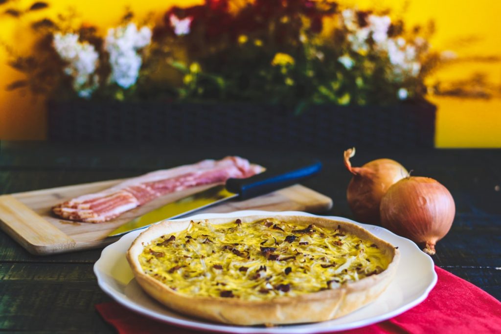
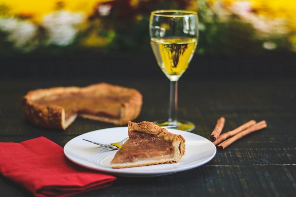
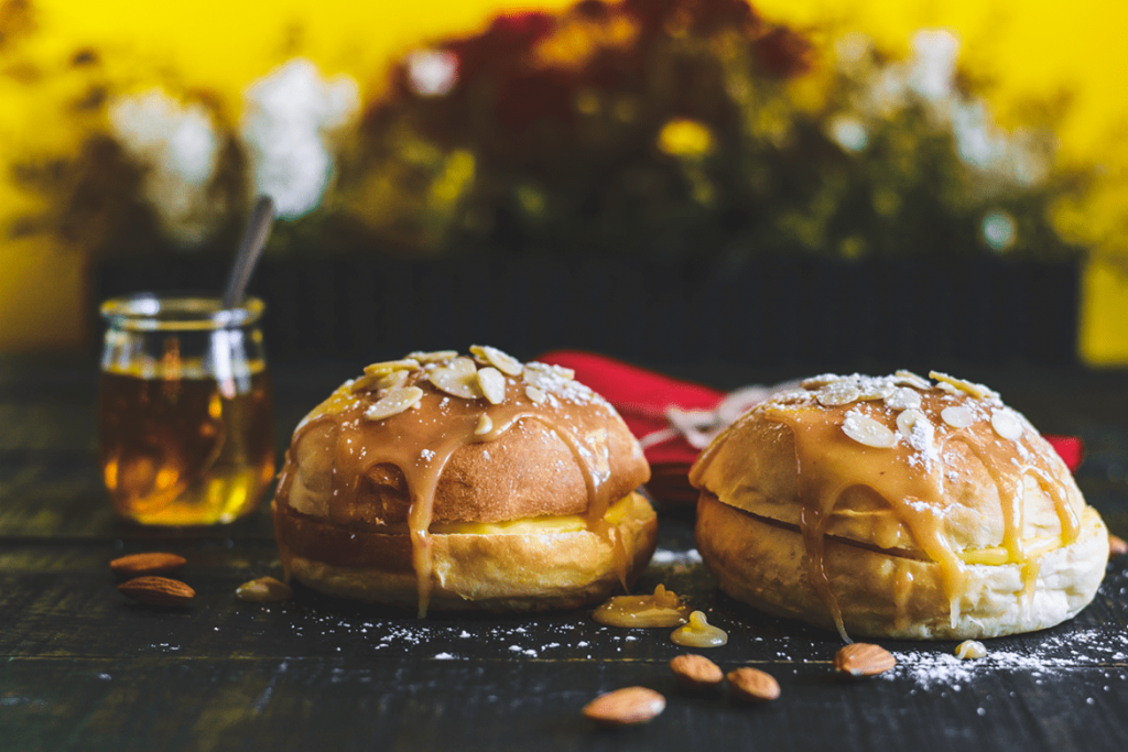
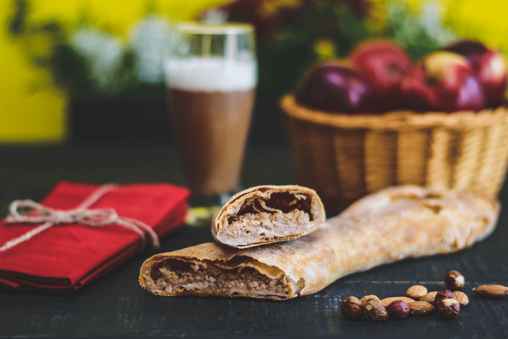
The pastry shop’s mission is to make Quebecers travel by introducing them to the European flavors of a variety of typically Germanic products such as apple strudel, Kirsch pie, wine cake and Berlin balls to name a few. them.
Delivrables
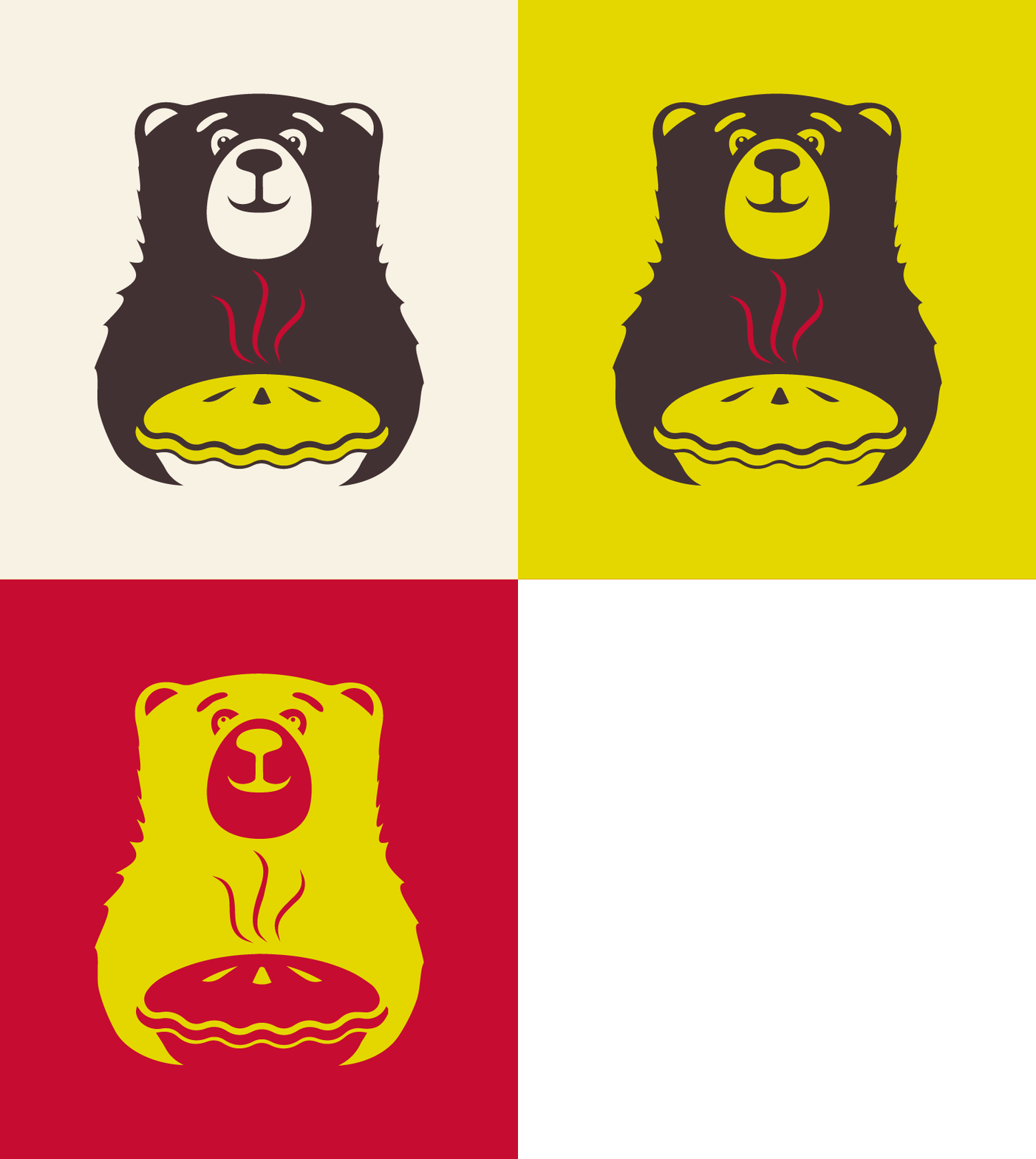
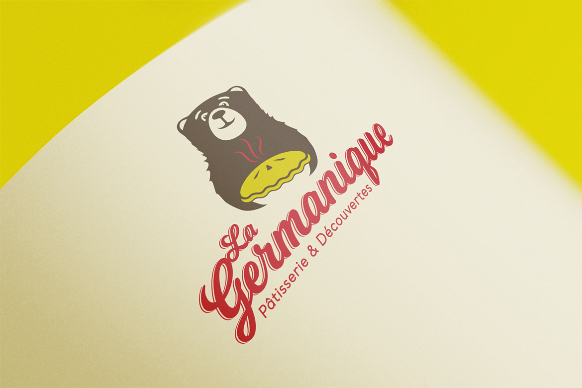
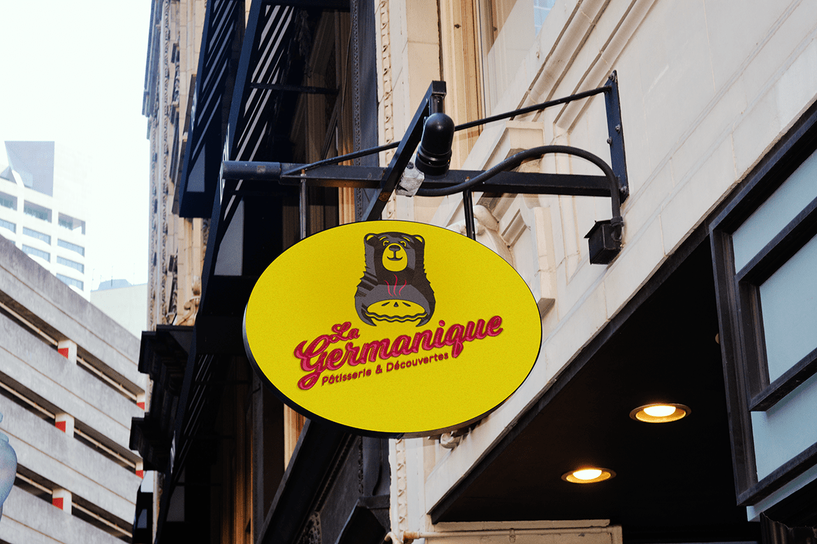
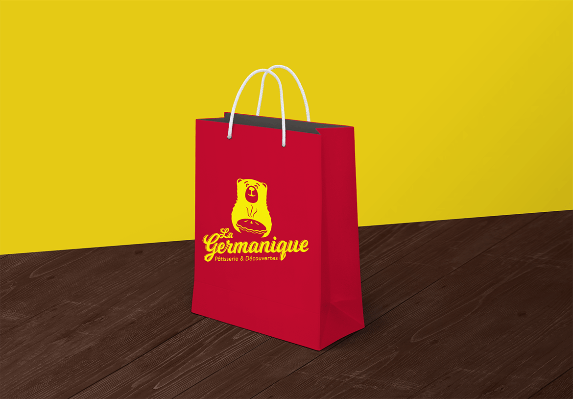
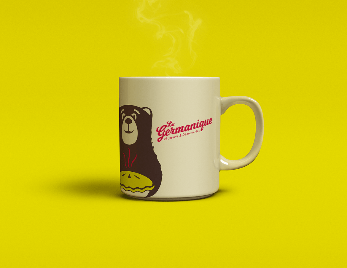
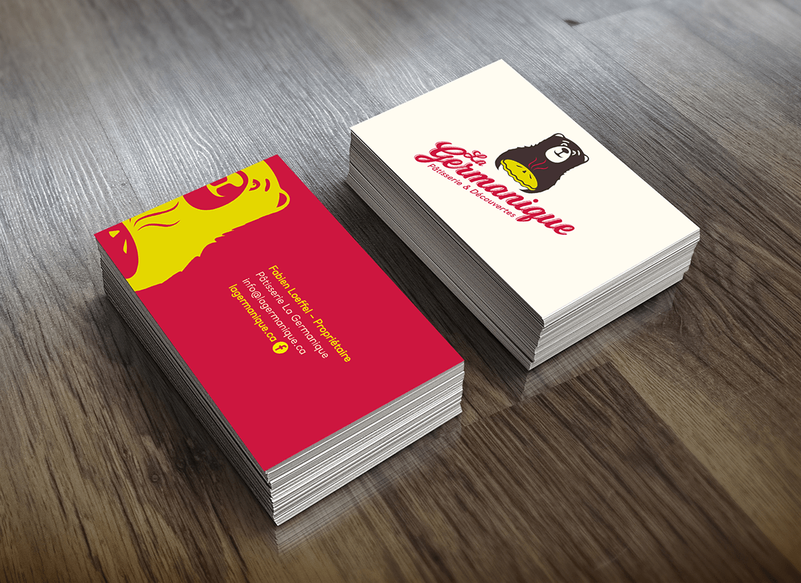
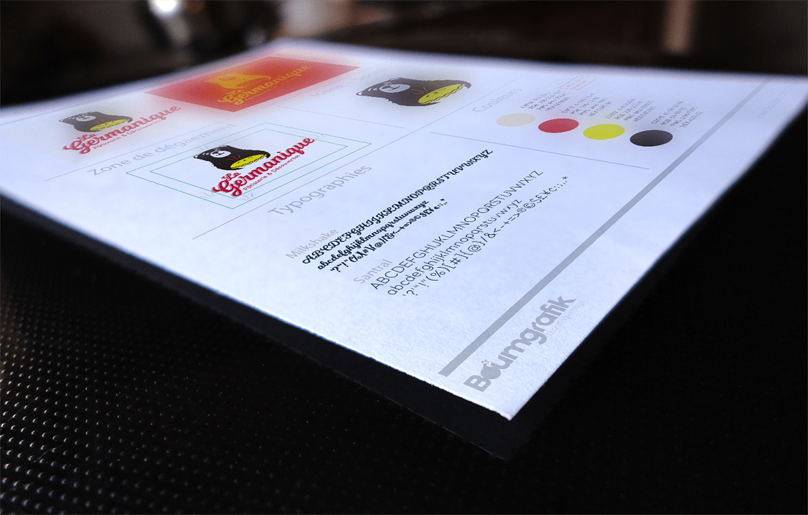
The identity is mainly based on the authentic and adventurous aspect of the company. The script type typography makes us discover a craft style, passionate and friendly. The typography of the logo is reminiscent of the traditional craft brands of European street shops (inn, tavern, etc.). It suggests a certain closeness and seems very welcoming. The representation of the bear first recalls the Bernese flag and the Germanic character of the company. It suggests tradition, but also the discovery and the natural atmosphere of Swiss landscapes, mountains and chalets. The bear is often associated with food and appetite. We also find a tart in reverse under the nose of the bear that suggests the nature of the business: pastry. The color palette is directly related to the colors of the German flag.
Client:
Pastry La Germanique
Skills:
- Brand image
- Logo design
- Communication tools
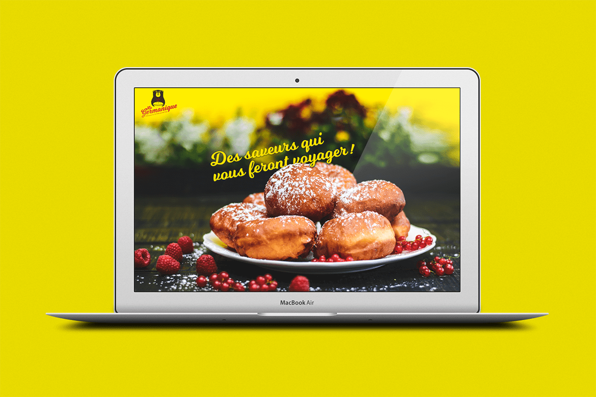
- Web Design
